BeckerArt FLOAT-YOUR-PIGMENT Newsletter June 14th, Summer Greens

Published: Tue, 06/14/16

 
Hello 

Welcome to the FLOAT-YOUR-PIGMENT Newsletter #59, Summer Greens

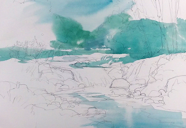
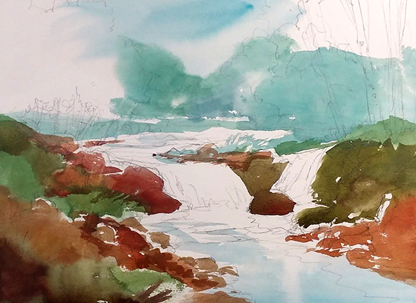
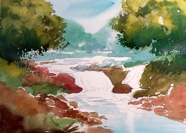
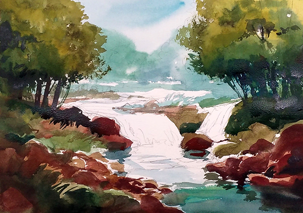
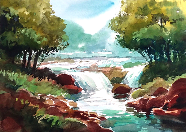
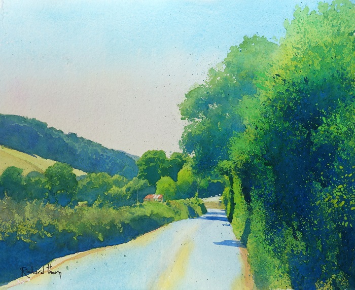
Summer weather is finally here in the midwest and most all the trees have dropped their blossoms of flowers, we are now faced with everything being green. It's wonderful for those hot summer days when you are looking for shade to get out of the sun. For the artist, it presents us with a problem of how to compose a painting with all that green and still make it colorful with a good light and dark pattern.
Today's newsletter will explain to you how I use the summer greens and make them work.

In 2 weeks I will be at Dillman's conducting a 4 day workshop, if you are signed up, I'll see you there. If you still want to sign up you better do it ASAP because I know there are only a couple of spots left.
GO HERE IF YOU ARE STILL LOOKING TO SIGN UP

NO CLASS this Thursday at the Civic Center in Libertyville.
YES to CLASS this coming Saturday June 18th at The Studio in McHenry.

Listed below are days we will NOT be having classes this summer.
I will not be teaching at the Civic Center in Libertyville June16th, 30th and July 21st, and 28th
Susan Macfarlan will be substituting for my classes on July 21st and 28th
No classes in McHenry at The Studio July 23rd and 30th
Please mark your calendars

 
Summer Greens
If you have every taken a class or workshop from yours truly, you know how much I don't like using green out of a tube and using green in general. When I do use green I like to mix them with Quinacridone Gold and any of the Blues on my palette.

Summer landscapes are filled with so much green and if you paint in the middle of the day when the sun is straight above, you are left with small scattered shadows making it necessary to use local colors to create a good value pattern. If everything in a scene is the same shade of green and there are no long light and dark shadows it becomes very difficult to create a good value pattern and composition because all the green in the trees, plants and grasses are the same color and value. This was something I became very aware of  last weekend while driving back from the east coast. When I drove down the highway I would look at the vast forest and landscape and saw that most everything was the same shade of green in turn making everything close to the same value. Because of this occurrence in the summer, I tell my students to get up early or wait until the evening when the sun is lower to the horizon to take their reference photos. The long shadows make it more dramatic and easier to find good value patterns.

In the middle of the day with all the trees being the same green, one usually can't see much difference from the color of the background trees to the ones in the foreground. This makes it really tough to show dimensions in your painting. My tip for creating dimension when every green in your reference is the same.....Change those greens, use gray and muted greens in the background and intensify your greens as you paint the middle ground and foreground.

When it comes to a color scheme with green in it, I always recommend you use a warm red or earth tone color which is the complementary color of green. Purple, of course, is what I call the magic color, use it along with green and it magically makes your painting look great. (not a scientific fact):)
See the demo below for how I used the red and green to compliment each other.

Again the simplest solution to references with a lot of green in them and no great value pattern, paint or take photos of the scene very early in the morning or later in the afternoon when the shadows are nice and long making it easier to sketch out a value pattern.

1. I start with painting the background greens and adding blue to them, this makes the greens stand back because it grays them up a little.
2. I now work the foreground with warm earth tones and I intensify the green making them look like they are in the foreground.
3. In this step I start adding some of my intense dark's along with more intense greens.
4. I now use my dark's to create the shapes of objects, like the tree trunks and branches along with the rocks and shadows.
5. the last step is to finish all the small details.

There was no reference used for this demonstration, I instead made it up using my experiences from the past to create this scene. In time and with a lot of paintings under your belt I hope you too will try and create scenes using your minds-eye.
 
One Week left to Sign-up for my at Dillman's 2016 BeckerArt Workshop
My Dillman's workshop in June is almost full, only a couple of spots left. If you are thinking of signing up do it ASAP so you don't miss out. There is also still time available to sign up for my Greek Islands Trip, sign-up for a trip/workshop of a lifetime!
 
Artist of the Week
Each week I will be bringing you an artist that I admire and that amazes me. I hope these artists will amaze and inspire you to keep on painting and develop your own style as much as they inspire me.

Richard Thorn Here is an artist I found on the internet that paints a lot of green scenes. He does them so masterfully. 
 
App of the Week
3 weeks ago the newsletter was about mobile apps that artists can use on their phones or tablets. If you know of a great app, please share it with us.

This week I bring you the app iWatermark that will put watermarks on your photos.
We all should be doing this to our photos of our paintings.
I haven't done this yet but have been told by many that I should.
​​​​​​​This will help protect the copyright of your own images. 

 
BeckerArt Brushes 

Get your amazing Superior Synthetic Blend  BeckerArt Brushes today.

1 1/4" Flat Series 020, #16 Round and a #4 Rigger Holbein Gold, Short Handle, Superior Synthetic Blend Watercolor Brushes. Made to my specifications, which were, The point of the 1 1/4" flat brush and the # 16 round had to come to a razor sharp point, along with a bounce back to straight action when applying watercolor to paper. The # 4 Rigger had to be the perfect length, the perfect thickness and the perfect point.

Click Here to Purchase​​​​​​​

 
Artwork Archive.com and get 20% off your first year. 
It's time to get your artistic life organized.
They also have a great newsletter about the art business when you sign up.
 
 For any other info please email me at david@davidrbecker.com