BeckerArt FLOAT-YOUR-PIGMENT Newsletter April 11th, Holbein Violets

Published: Tue, 04/11/17

Hello 

Welcome to the FLOAT-YOUR-PIGMENT Newsletter #101,  Holbein Violets

It's that time of year when all the pastel like colors pop up everywhere. With spring and Easter close by you start to see so much color after a drab colored winter, especially in a big city like my hometown of Chicago.
It started me thinking about my favorite color purple so I decided to test out all the colors of purple and violet that Holbein puts out. See below for my results

Last month I donated a small acrylic painting to an animal shelter fundraiser called Art for the Paws
This is an amazing event to help out an animal shelter and purchase at auction some amazing works of art at the same time. There are 100s of works to choose from... you can bid on mine HERE

This Thursday is the Lake Region Watercolor Guild meeting in Grayslake, IL. Here is the info for those of you interested in watching a demonstration by Sarah Yeoman

Happy Easter
David

Yes to Class at the Civic Center in Libertyville on April 13th
Yes to Class at The Studio in McHenry on April15th
 
Holbein Violets​​​​​​​
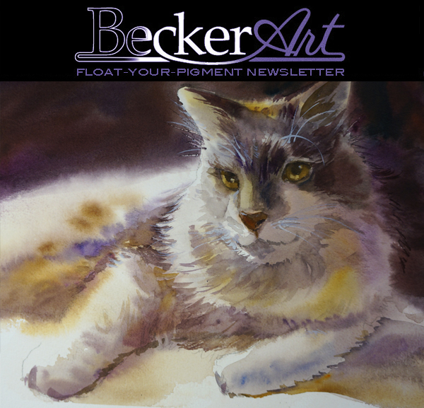
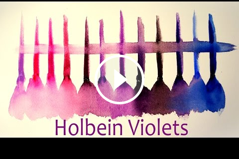
Yes, I love the color of purple! Every student that has ever taken my class knows how much I love the color of purple and I call it the magic color. Any time you use the color it magically makes your painting look good.

My students also know I love the Holbein company and their wonderful products. So I got ahold of Holbein and asked them to send me all of their violet and purple colors. The list is below along with a video I made to show you what those colors look like. I have to apologize beforehand about not having the best lighting in the video. In the near future, I will be setting up a filming area in my studio for more professional looking videos.

Here is a list of the Holbein Artists Watercolors
  • Lavender- this is more of an opaque pastel looking like color and this color I forgot to get in the video
  • Lilac- is also an opaque pastel looking like color. These opaque colors have the feel of Gouache.
  • Opera- is the most intense pink watercolor on the planet, great for mixing wonderful violets.
  • Bright Rose- is very close to the Opera but just a little less intense.
  • Quinacridone Magenta- has an alizarin crimson kind of look to it.
  • Quinacridone Violet- also kind of like Alizarin with more of a darker purple hue.
  • Cobalt Violet Bright- the pigment felt like it handled a little different, not quite sure why so I will be testing that color this week to see what it was that made it handle differently. It is a nice light purple color.
  • Bright Violet- this was a very vibrant violet and is one I think will become a new favorite.
  • Mineral Violet- more of a darker gray violet
  • Permanent Violet- this has been my go to violet for as long as I can remember. Beautiful purple
  • Mars Violet- a brown shaded violet
  • Verditer- not sure how to pronounce this color but it is a blue with a light shade of violet.
  • Phthalo Blue Red Shade- this color is pretty much a vibrant blue with a very slight shade of warmth. Probably very good to use for mixing together with other violets to produce wonderful shades of violet
Those are the violets that I tested and I probably will be putting 2 new violets on my palette, which will be Bright Violet and Bright Rose

My second favorite color is orange, will have to test oranges next.

David

 
Watercolor Society of the Week
American Watercolor Society just sent out their exhibition hardcover catalog of this year's exhibition. All I have to say is WOW!

What an amazing show!

get your own copy of the catalog HERE
 
Fundraiser of the Week
Here is the fundraiser I was talking about above. The shelter is the Helping Paws Animal Shelter and they put on this event every year. I have donated a piece since they started 3 years ago. Each year it has gotten bigger and it has been great fun watching how it has grown. 

If you would like to bid on my piece
CLICK HERE


Great brushes for your violet colors!

1 1/4" Flat Series 020, #16 Round and a #4 Rigger Holbein Gold, Short Handle, Superior Synthetic Blend Watercolor Brushes. Made to my specifications, which were, The point of the 1 1/4" flat brush and the # 16 round had to come to a razor sharp point, along with a bounce back to straight action when applying watercolor to paper. The # 4 Rigger had to be the perfect length, the perfect thickness, and the perfect point.

Click Here to Purchase​​​​​​​

 
 For any other info please email me at david@davidrbecker.com